Junghans Max Bill Watch Review
Tuesday - 17 May 2016

Imagine the delicate pink cherry blossom transforming the lifeless trees, the welcomed sea breeze cooling the skin and the blazing hot sun shining light and happiness - it is a picturesque image associated with the Summer months that Junghans have captured in their newest Max Bill models. The gentle, delicate hues encompass the dial radiating the joys of Summer from the wrist.
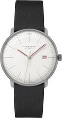
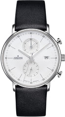
The essence of the pure, minimal Max Bill design remains in intact despite the injection of pastel colours. The subtle, orderly dial derives from the concept of the 1956 Max Bill kitchen clock boasting a logical layout that serves the notion “form follows function”. By transferring the characteristics to a wristwatch format in 1961, the Max Bill timepiece was born with a clear, precise structure that strives for aesthetic perfection.
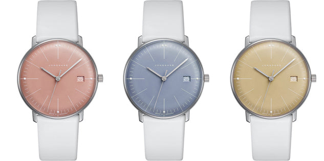
The latest design embraces the initial inspiration hosting a minimal, clear arrangement with one style favouring the subtle, fine silver markings whereas the other adds charcoal grey numerals; both serve as a beautiful, elegant presentation of time bringing a tranquility and calmness to the feminine instrument. To guarantee legibility 3, 6, 9 and 12 o’clock are luminescent providing a necessary glow for time to be read at a quick glance.
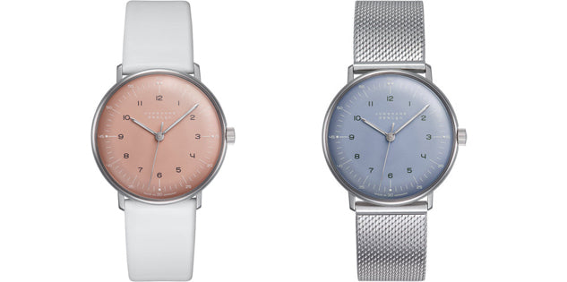
As a symbol of the sunny warmer months Junghans opted for gentle, graceful shades of warm pink, cool blue and honey yellow; a direct reference to cherry blossom, the sea and the sun. Crisp white leather straps are chosen as another reminder of Summer, which contrasts beautifully with the pastel hue dials; a mesmerising collaboration as they shimmer in the light.
Paying tribute to the anticipation of the beautiful Summer season, Junghans present a very different revised design of the Max Bill without loosing the pure, minimal essence that was cemented over 60 years ago. The gentle colours are a celebration of the months that bring lighter evenings, beautiful flowers and a happier wellbeing.